


All images used are CC0 stock photo's sourced primarily from Pexels.

Beginning on the 23rd of November 2017 I was hired as a Graphic Design / Admin Intern at Rouge Studios.
Rouge Studios is a start up dance studio that had recently relaunched prior to my hire, my workstation was a dual screen mac that had the adobe CC collection installed, as such I primarily worked in Adobe Illustrator


Month 1
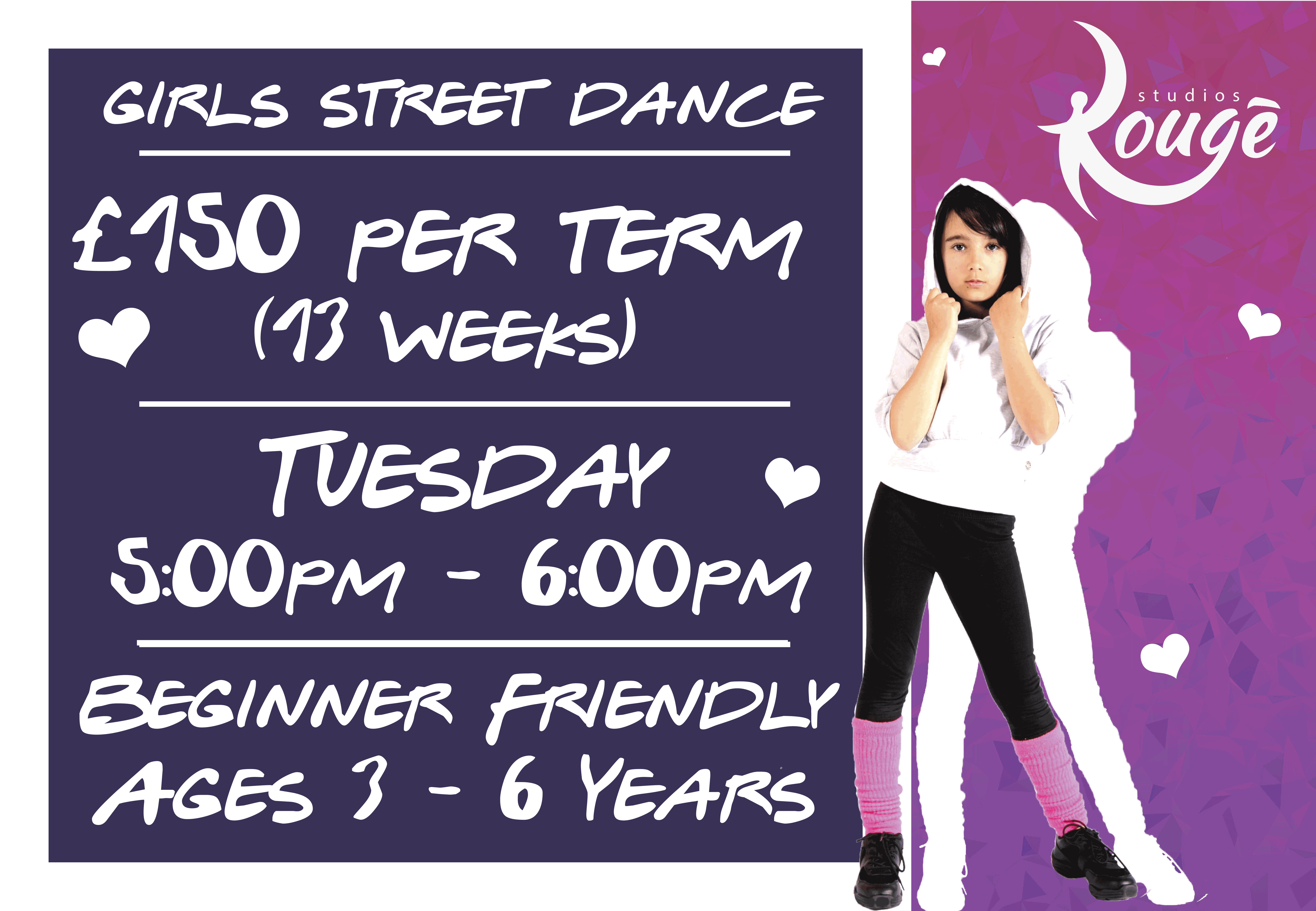
My first task was to create a leaflet displaying the new kids classes for 2018, I was restricted to the assets already on the computer and told to base the design off of previous ones.
I completed the initial design within a day and then spent the next week conducting minor edits to the contents of the leaflet. I had to get the design approved by two separate people and ensure that all of the information was present. This was a good experience as it gave me an insight into how designs develop overtime and that keeping a log of previous designs is essential, as multiple times during the process I was asked to revert changes.

My second assignment was to create a leaflet for the Christmas party, as I wasn't given a guideline for the design I had a little more freedom to add my own personal flair.


I experimented with Photoshop in order to achieve the desired results, I initially stuck to minor changes like the hue on the background, but I ended up cutting the Christmas hats out of one image and placing them onto the others. Although I much prefer Illustrator to Photoshop, they each have their own specialties and using them in tandem has helped broaden my designing capabilities.
This design allowed me to test how my vector art could be used in tandem with actual photo's to produce something visually attractive. The back page of this leaflet contains artwork of reindeer that I made from scratch in illustrator using the curvature tool, although that is something I was relatively good at prior to this internship in order to tie in the festive theme I ended up learning how to produce a random pattern in illustrator using the symbol sprayer tool, something I didn't even know existed prior to this.
The Christmas leaflet also gave me a harsh lesson in layer management, as there were so many overlapping images I ended up having to separate them into sets which I then split into layers, being able to lock the layers stopped me from accidentally moving things and in general is a good work practice that I will be endeavoring to continue with.
As Rouge is a start up a large portion of my time ended up being consumed by admin, I was tasked with finding the best prices for the printing of leaflets and throughout my interneship was expected to answer the phone and deal with customers as and when necessary.
Although this may not directly correlate to my course I feel like it will effect my public speaking as I dealt with customers consistently throughout the placement.
I was trusted with locking up the studio on multiple occasions and had to cover my co workers shifts multiple times, this meant that I was taught how to operate the studio alarm. A responsibility that I may potentially be given again in the future regardless of where my career takes me, as such I took it very seriously and ensured that the studio was secure.
My third task was to produce a template for class adverts that were designed to be placed on social media, I was given a set of information for each class and told to produce something quick that could be easily edited in case we needed to post a new class.


During this assignment I started sourcing CC0 images from Pexels in order to create some variety in the designs as they were all derived from the same template
This task took multiple weeks as I had to cover multiple classes and get each design approved. An issue that I ran into on multiple occasions with these designs was that the boss didn't like the image I chose for the person on the right, or just generally thought we could use something better. Although the studio hosted the lessons whilst I was present I wasn't allowed to take photo's during them for use on the advert and as such had to keep searching and checking with my boss until I found an image that she approved of.
Month 2
My second month of employment started with the continuation of the adverts for social media. After I had finished the aforementioned task I was then introduced to Mail Chimp.
I was given a few weeks of training in how to produce a 'Mail Blast' and was then tasked with producing two separate mail blasts for the new classes for 2018 and the Christmas party.
My first attempt at using Mail Chimp was the Rouge 2018 email, I largely stuck to the default formatting of the email and simply edited the assets I had already created (The social adverts) to fit the format.
The second time around Instead of just importing my assets into Mail Chimp I used some tricks to change the formatting, one of which included placing imagery in the background and then placing a completely blank image in the foreground. One example of this is the adults / children's ticket pricing.
On the 14th of January I conducted my first Industry related exhibition, Top Drawer.
Top Drawer is a showcase of up and coming products, largely by professionals however there were a couple of new businesses making their mark.

I wasn't allowed to take photographs inside the exhibition, however it was a great experience as I was able to witness a massive variety in showrooms.
The exhibition had a strict buying policy, only customers with proof of trade could purchase anything, This fact was very interesting to me as the exhibition was specifically marketed towards businesses that would be selling on the designs.
The main things I took away from Top Drawer was that even if a sector of the market is already populated a niche or particularly exceptional design will still sell and that there are limitless ways to display products.
One showroom I saw at Top Drawer was an outdoor furniture company that assembled an entire greenhouse as their showroom, they had hanging plants and each plant was placed specifically to draw attention to the chair/bench in its vicinity.
Another showroom was for a homeware and gifts company that sold all of their designs in a large variety of colors, they had a color wheel on the back wall displaying every color that they sold products in. Although the mugs weren't the primary focus a large amount of visitors were attracted to it and subsequently ended up visiting them. This was a great example of POS for me.
Month 3
Month 3 started with the creating of a for hire poster, I decided to use a simple vector style for this, and learning from my previous mistakes made the design a square (as Instagram uses squares for its preview the previous socials posters didn't display optimally.)

For this project I was granted access to the Rouge Studios google drive which contained a small variety of photo's that were taken within the studios.
As this was a poster asking for new staff I thought it would be best to only use the studios assets.
This project was a good exercise in enforcing brand identity as the poster had to represent what Rouge Studios was. It also helped me with understanding how Instagram's preview functions and how large I had to make things if they were to stand out on it.
In general I saw this task as a proper introduction to advertising on social media.
My second task for the month was to produce a design for a vinyl banner that people would see upon entering the studio.
This was the first task that I was consistently working on in the background whilst dealing with other more urgent tasks, as it didn't have a looming deadline I constantly ran the design back and forth with my boss in order to make sure it was exactly what she was looking for.

This design actually went through a huge amount of variations. I personally don't like it but I was told I had to list every single class we offered on it and was given a large list of information that absolutely had to be included on it.

My initial designs for this poster had a very different vibe to the final one.
I originally planned to have one feature image in the foreground and have images representing the different classes in the background that were greyed out.
One reason I moved away from that idea was that the individual images were all saved at their full resolution in Illustrator and as such caused the file to visibly lag and become almost impossible to edit.
During the period of time that I was working on this sign I was the only person in the graphics department and subsequently I was one of the only people to be checking this over, which unfortunately resulted in us printing a poster with a typo (Meeditation).
This was a good lesson in quality control and why its always good to have multiple people check over my work.
The second task I was working on for the month was a single sided swing sign for the outside of the studio.

This design was purely to advertise the hiring of the space and as such had to show as much of the studio as possible
I tried to make the design as simple as possible to ensure that it would be understandable from far away however I feel like I could have produced a better design if it was two sided as I could have included all the visual intrigue on one side and all of the relevant information on the back.
Regardless of my opinion on the matter restrictions based on money and practicality can and will exist in the future, so being introduced to them now was useful.
The third task for the month was for a flyer to advertise the new classes for adults.


I used a similar style to the initial draft of the vinyl sign in an attempt to increase the cohesiveness of the brand.
Although the style is heavily based on images between parallel lines, in retrospect I feel like having the text slanted was a bad idea as it would just result in people tilting the leaflet to be able to read it, or alternatively throwing it away out of annoyance.
Overall I feel like the leaflet has too much going on and not enough variety to differentiate the foreground from the background.
This design and the design for the swing sign ended up not being used due to price constraints. Although it was slightly annoying to have worked on something that ended up not being used it was a good exercise in resource management as all of the squares in the background were actually separate, this led to me splitting them into groups and layers.
Month 4
Month 4 was a massive change in pace as there was a change in management, the hierarchy changed slightly so instead of directly reporting to the boss of the company, instead I needed to report to the manager who would then converse with the boss instead. This also meant that the new boss would be the one who was assigning projects to me.
After familiarizing myself with the new chain of command I was questioned about my capability to create and edit websites, after displaying my portfolio website I was given the credentials and the capability to edit the Rouge Studios website. My first task of the month was to comb over the website and fix the (roughly 5) typo's and graphical inconsistencies.
I hadn't worked with WordPress prior to this however I found it relatively easy to learn due to the Divi add on that the website was built using.
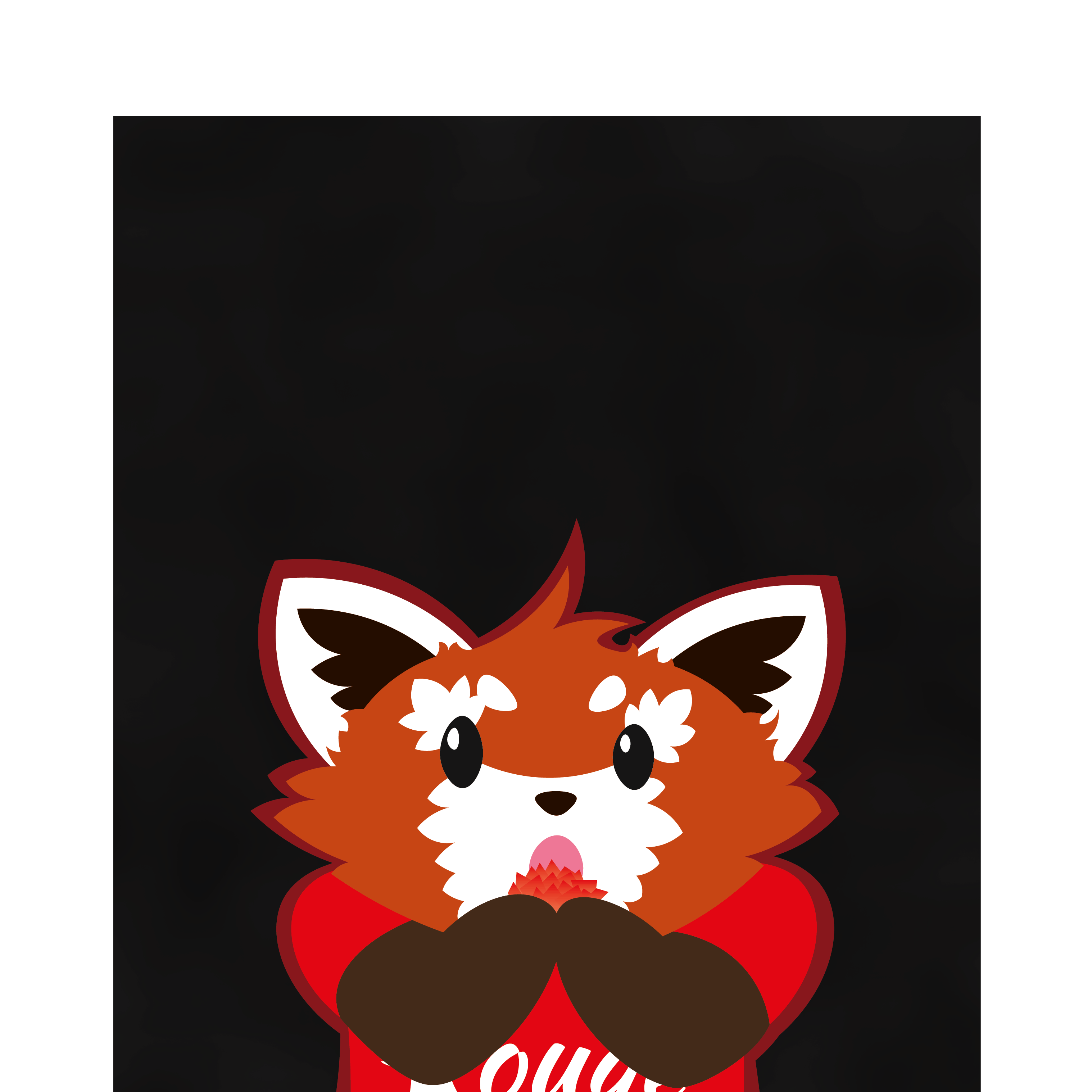
With the arrival of a new manager came the relaunch of the studio, in preparation for this I was asked if I had any ideas for the studio going forward. The main idea I had was to create a mascot for the studio that would aid in the marketing of kids classes.
I pitched the concept of using a red panda which went down very well with my manager based solely on one sketch.

My manager then instructed me to produce a proper version of the sketch on the computer so that she could see the possible uses of it. I was also instructed to produce a couple of variants that were more tailored to the different classes.
.png)
After loading my initial sketch into illustrator and tracing it through I adapted it to represent acting and then I produced two additional designs based off of the singing and ballet classes.
The mascots were created in my cartoonist style however I attempted to develop upon my style to better suit the company and instead of using the bold line work that I prefer I created a completely line-less mascot and used varying shades to create the illusion of depth.
Making the mascots entirely in illustrator probably wasn't the best idea however it meant that when my manager asked me to edit the designs I was able to edit the individual pieces instead of reproducing the entire image.
Whilst I spent most of the month familiarizing myself with WordPress and how to use it, I still had a bit of free time, which I used to revisit some of the social adverts, I decided to add minor animations to them in order to provide visual intrigue.
Although this is a simple two frame animation it was my first time animating something in Photoshop so it was a valuable experience.
Due to the introduction of the new manager I spent a large amount of the month helping her settle in and I ended up manning the reception and dealing with customers for a large portion of the month.
Although I assume this is an event that is exclusive to start ups, having to cover another persons job might be something I need to be prepared for in the future.
Month 5
Month 5 saw me starting the overhaul of the Rouge Studios website, I started out by streamlining the contact page and adding imagery to make it easier to navigate.

I also remade the menu bar, I added the logo to it and used Font-Awesome to add a logo for Instagram.
I redid the team page in order to properly display the teachers.
I was provided with bio's for each of the teachers that they wrote themselves, I was not allowed to edit these however I would have greatly preferred if they were shorter.

I edited the head-shot images that I was provided with to fit into circles in order to make the page look cleaner
This page in particular was very difficult for me as I hadn't used WordPress previously. I had to use CSS code to ensure that the images were in line with each other.
I was also tasked with producing a large amount of simple images for Facebook / Instagram. I suggested a format where the relevant text was about a sentence long and a silhouette was used to represent whatever we were advertising.


I had to include the Rouge logo in every image which was something I didn't really understand as these images were created to be posted on the Rouge social media pages.
Although this was a simple design it led me to experiment more in illustrator which has aided me in developing that skill. For example in this design I used the 'extract outline' feature in illustrator to convert the text to a shape, which allowed me to apply a gradient as a clipping mask.
I also used these images to learn how to add multiple gradients to one image and how I could use groups to ensure that the gradients aligned perfectly.


Rouge Studios had previously been using Mindbody to handle bookings and at the new managers request I was placed in charge of switching us over to book when.
Since Rouge Studios offered so many classes I spent a massive amount of the month moving them from one system to another and adding the payment options, although this was a task that I shared with another employee it was still assigned to me as my primary task for the month and as such left little time for graphic design.


I was also tasked with quickly producing a banner and some icons for YouTube, they are very simple but it was nice to use assets I had made previously. This also was good as it proved that keeping all of the previous files I had worked on was a good idea.
Month 6
Month 6 was largely pent distributing leaflets and dealing with clients. I was enlisted into the leafleting effort and spent a couple of weeks going door to door posting them.
The small amount of graphic design I did do during this month was the culmination of my efforts to learn how to animate in Photoshop.
The animation on the left was to celebrate the launch of the Rouge Studios new website, I made the rocket from scratch and used a cloud brush tool to create the effects. This was also the first time I messed with the timing for the frames, having the number frames take longer to change and the smoke frames change faster in order to create a smoother animation.
The animation on the right was simpler however I made each frame from scratch incorporated my style slightly br creating the bold border. I also used a trick with the transparent background to create the a greater impact when the red panda throws the confetti.
Overall these two animations were a good way for me to test the capabilities of Photoshop and what I personally could do with it.
At my managers request I also ended up producing some logo designs for her friend based off of two sketches that I was provided with.


I stayed true to the sketch with the first design but gave myself more creative freedom with the second one, I used the wrap function of Illustrator to make it look like the words were physically written on the balloons.
Although this wasn't specifically a work task it was a good insight into how referrals work, however I feel like these designs are a bit too rectangular to properly function as a logo.
For my second Industrial visit I went to Clerkenwell design week, It was an amazing experience where both industrial professionals, start ups and students alike could place their designs in the spotlight.

There were a huge variety of things to see at Clerkenwell, A group of students were raising awareness for how much waste bags produce and were running a 'print your own tote bag' store where visitors could print a tote bag with an optional donation of £3. This was great to see as it shows that students can get into these kinds of events as hosts instead of just visitors.
Another thing I took from Clerkenwell was the experience of the Pop-Up Shop, where freelance designers were selling thier own work, the items for sale ranged from bespoke postcards to enamel pins. As Clerkenwell design week was an 'open to all' event these items were available to purchase.
Each showroom / exhibition was listed in the guide book and visitors were given a guide as to the events that they could participate in during the week, one thing that I found interesting about the event was Cemento, a company that set about to re-imagine concrete. They gave away samples of their concrete to visitors and a wrist band that kept a small leaflet attached that described their company. This was particularly interesting to me as unlike the rest of the exhibits they weren't selling a product but instead a material.

Overall I took the internship as an opportunity to further develop my graphical design skills, although I didn't manage to leave a lasting affect on the company as they relaunched once more under new management after I left.